CartaBella

l'Artista Blog

February 26, 2009
by Bonnie Porter
1 Comment

BELL’ARTE classes are underway!

A proud second grade artist, In-the-style-of Albrecht Durer, “The Hare”, shown above.

Nine young students sketched and colored and played shape games. First, they sketched a bird from my family room mural. Then they drew a tropical bird, similar to those found in Mona Brookes‘ book, DRAWING WITH CHILDREN, and colored it with colored pencil. We then mounted the drawings on 8X10 wallpaper remnants.

Their homework assignment this week is to read the brief bio about Albrecht Durer and render a likeness of Durer’s famous rabbit.

February 9, 2009
by Bonnie Porter
1 Comment


MONDAY MONTAGE. Brita…A WORK IN PROGRESS!

. . . an on-going drawing and painting journey as I explore the techniques of Master Artist, Carl Larsson. I will post a copy of the painting, too, for critique and comparison to my work (left).

Carl and Karin Larsson are Swedish artists of the Arts & Crafts Movement era. Carl (1853-1919) is known worldwide for his paintings of his home and family. Karin, a textile designer, also created an interior design style that continues to inspire interior designers today.

Living in Helsinki in the 70’s, I was immediately drawn to his works, perhaps because Larssons’ paintings capture the Scandinavian way of life and a different cultural heritage I was experiencing for the first time. We had three preschoolers in that season of life. And I was overwhelmed with the adjustments necessary to survive the blustery weather and the metropolitan European city lifestyle. A far cry from the American Southwest. . . . From the land of beige with blazing sunsets and occasional rainfall to the land of forests, lakes and never-ending snow.

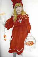
Now, in the process of developing a series of art lessons in-the-style of Carl Larsson, I chose to copy this winter scene favorite, “Brita with Candles and Apples”. I am still working on drawing figures and painting portraits in watercolor. So sketching Brita was a challenge for me in itself.

One intriguing part of breaking down this project in order to understand Larsson’s style and techniques has been the investigation of his palette. The reproduction I chose to use as a reference image was printed on shiny Christmas wrapping paper (from Germany) and so I selected Winsor red to capture the brilliant contrast to the stark white background.

However, since then I’ve found other reproductions of the same painting with completely different tones and values in both the little girl’s dress and the background. So after I finish this one, I intend to do another one with a more subtle palette. I’m wondering which reds he actually used and whether or not I can find anything written by him/about him which might describe his color palette.

Look for more postings re:Larsson’s techniques. His painting style, in combination with his wife’s design style, became a trendsetter for what is now known as The Swedish Style of Design.

January 9, 2009
by Bonnie Porter
Comments Off on

MONDAY MONTAGE. “to everything there is a season. . . .”

From the gardens of Tuscany and vineyards of Chianti . . . to the gardens and vineyards of my East Cobb Atlanta neighborhood, I continue to find inspiration for sketching and painting.

My most recent watercolor interpretation of the garden in Tuscany where I started painting is looser, more wet-into-wet, like my sketchbook series. Now I want to re-visit this same Chianti garden via a large canvas and my tubes of artists’ acrylics. Then I plan to see what happens when I dig out my fabric remnants and see where that journey takes me. . . among the vineyards and terracotta pots of Bell’ Italia.

November 2, 2008
by Bonnie Porter
Comments Off on

CAPTURING FALL COLORS! One of life’s simple pleasures—making prints with fruit and vegetable stamps. Recycle paper and paper bags by stamping and creating notecards, wrapping paper, gift bags, etc.

Caution: this project is addictive! My husband wondered what I was “working on” for such a long time in the kitchen. . . .


November 2, 2008
by Bonnie Porter
Comments Off on

MONDAY MONTAGE. in the style of . . . Mondrian

http://coreknowledge.org/CK/resrcs/lessons/Prek.htm

My daughters-in-law discovered this website with Art Lesson Plans they knew I’d like. So this week my Homeschool art class did one of the Piet Mondrian lessons and loved it! We studied “Broadway Boogie Woogie,” the New York artist’s painting made in 1942-43. It was easy for my young artists to “grasp” what the artist communicated—after we looked at a street map of Atlanta and compared Peachtree to NYC’s Broadway!

Then we used matchbox cars, dipped in yellow paint, to imitate the straight street lines. So much fun to run the little car’s tire marks right across the white paper until a grid shows up. Wooden blocks dipped in red and blue paint made “buildings” appear in the style of Mondrian.

What did we do with the leftover paint? Primary colors can be blended to make orange, green and violet. Beautiful apple core prints stamped and danced across the blank cards and we ended up with decorative note cards to take home.

October 20, 2008
by Bonnie Porter
Comments Off on

Painting in the
style of Van Gogh!


IMPASTO recipe: 1/2 C. medium thick tempera paint + 1 Tbsp. white detergent powder (or cornstarch, white flour, etc.). Thin with water or add more powder to thicken. Scoop dollops of paint onto sytrofoam grocery trays, keeping colors apart. Apply paint to heavy paper or posterboard using a popscicle stick to texturize the paint– make lines, squiggles, shapes, etc.